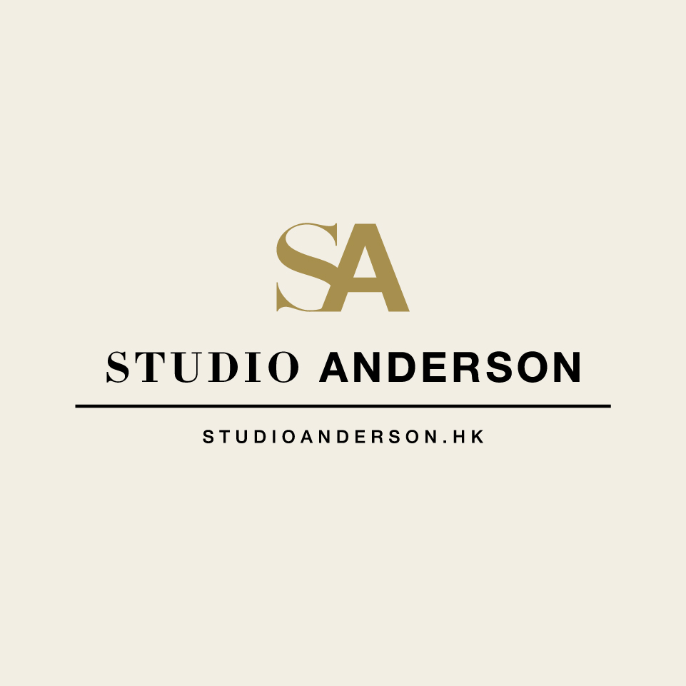
Studio Anderson logo launch

To further build up our brand image, Studio Anderson proudly presents our new logo today.
The main part of the logo forms with the SA letters which refer to the abbreviation of Studio Anderson. The two different font types, with one using the classic calligraphy style font and another one using the modern simple style font, symbolize the essence of weddings in Hong Kong – the old meets the new, and the traditional Chinese custom meets the contemporary western culture. SA is also embedded with my partner, Sam, and my name (Anderson), showcasing our very diverse yet complementary characters.
The theme colours of our brand – warm grey and gold, offering a dose of classy and warm feeling which perfectly match with our wedding photography.
Studio Anderson takes this opportunity to thank you all for your unfailing support during the past year. We believe our passion for wedding photography will enable us to excel in the future endeavours. THANK YOU!!
Logo design by: Alander Wong (http://cargocollective.com/alander)
